The plotting functions are how an indicator displays data. The universal plot() covers most cases; the plotLine/plotBar/plotCandle/plotShape variants offer chart-type-specific defaults; plotText/plotLabel/plotTable/plotRange add chart annotations.
| Function | Description |
|---|---|
plot | Universal plot — line, bar, candle, point |
plotLine | Line chart with enhanced styling |
plotBar | OHLC bar chart |
plotCandle | Candlestick chart |
plotShape | Custom shapes / markers |
plotText | Text label at a price level |
plotLabel | Fixed-position text label |
plotTable | Fixed-position table |
plotRange | Rectangular box between two time/price points |
hline | Horizontal reference line |
plotBgColor | Background color band |
plot
Use plot() when you want one flexible renderer that can display the same source data as a line, spline, histogram bar, candlestick, or point series. It is useful for generic helpers and configurable indicators where the plot style may change based on user input.
plot(value, plotType?, width?, colors?, colorIndex?, fill?, smooth?, showPriceDisplay?, label?, desc?) — universal plotting function.
| Parameter | Type | Description |
|---|---|---|
value | TimeSeries | Data series to visualize |
plotType | string | "spline"/"line" for lines, "bar" for histogram, "candle" for OHLC, "point" for dots |
width | number | Thickness of lines or size of bars/points (1–5) |
colors | string[] | Color array — format depends on plot type and fill mode |
colorIndex | string | number | Per-bar color override |
fill | boolean | 'momentum_fill' | true for area fill, 'momentum_fill' for conditional coloring |
smooth | boolean | Smooth line curves |
showPriceDisplay | boolean | Show current value in the price scale (default: false) |
label | string[] | Legend labels per series |
desc | string[] | Long descriptions per series |
//@version=2

// Simple line plot
plot(value=smaData, plotType="spline", width=2, colors=["#2196f3"], fill=true, label=["SMA"], desc=["Simple Moving Average"]);

// Using colorIndex to select specific color from array
plot(value=rsiData, plotType="line", width=2, colors=["#ff0000", "#00ff00", "#0000ff"], colorIndex=2, fill=true, label=["RSI"], desc=["RSI with Blue Color"]); // Uses blue (index 2)

// Histogram with positive/negative colors
plot(value=volumeDelta, plotType="bar", width=1, colors=["#00ff88", "#ff4444"], label=["Volume Delta"], desc=["Volume Delta Histogram"]);
plotLine
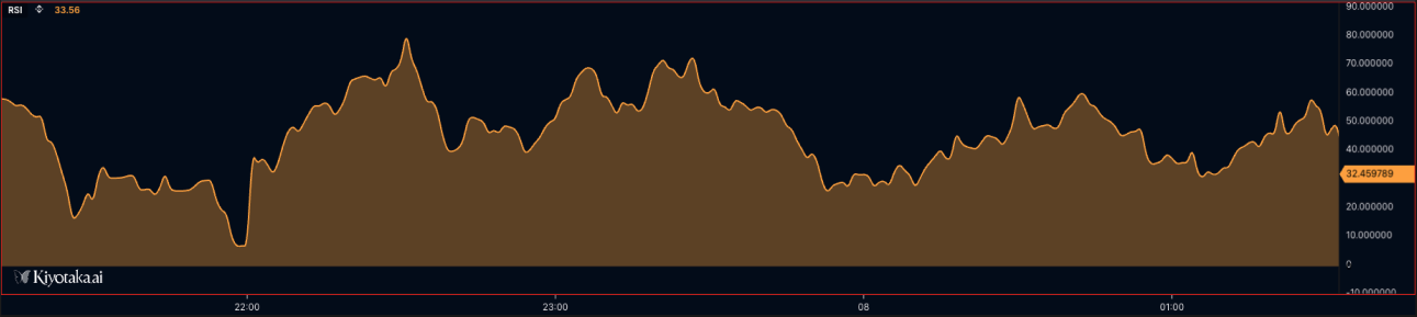
Renders data as enhanced line charts for indicators like moving averages, RSI, momentum, bands, and other continuous values. Use it when you need line width control, smoothing, area fills, momentum fills, per-bar color selection, or multiple plotted series.
plotLine(value, width?, colors?, colorIndex?, fill?, smooth?, showPriceDisplay?, label?, desc?) — line chart with enhanced styling options.
| Parameter | Type | Description |
|---|---|---|
value | TimeSeries | Data series to plot as lines |
width | number | Line width (default: 2) |
colors | color[] | Color array (default: ['orange']) |
colorIndex | string | number | Per-bar color override |
fill | boolean | 'momentum_fill' | 'default' | Fill options for area under lines (default: false) |
smooth | boolean | Enable smooth line rendering (default: false) |
showPriceDisplay | boolean | Show current value in price scale (default: false) |
label | string[] | Legend labels |
desc | string[] | Long descriptions |
Visual Example
//@version=2

// Simple line with solid fill
plotLine(value=sma20, width=2, colors=["#2196f3"], fill=true, smooth=true, label=["SMA 20"], desc=["20-period Simple Moving Average"]);

// Line with no fill (line only)
plotLine(value=ema50, width=2, colors=["#ff6b35"], fill=false, smooth=true, label=["EMA 50"], desc=["50-period Exponential Moving Average"]);

// Line with 30% opacity fill
plotLine(value=rsi, width=2, colors=["#9c27b0"], fill=0.3, smooth=true, label=["RSI"], desc=["Relative Strength Index"]);

// Using colorIndex to select specific color from array
plotLine(value=rsiData, width=2, colors=["#ff0000", "#00ff00", "#0000ff"], colorIndex=1, fill=true, smooth=true, label=["RSI"], desc=["RSI with Green Color"]); // Uses green (index 1)

// MOMENTUM FILL - Conditional coloring based on positive/negative values
// Requires 4-color array: [posLineColor, negLineColor, posFillColor, negFillColor]
plotLine(value=momentum, width=2, colors=[
    "#00ff88",   // Color 0: Positive value line color (green)
    "#ff4444",   // Color 1: Negative value line color (red)
    "#00ff8830", // Color 2: Positive value fill color (green with transparency)
    "#ff444430"  // Color 3: Negative value fill color (red with transparency)
], fill="momentum_fill", smooth=true, label=["Momentum"], desc=["Momentum with Conditional Fill"]);
// When momentum > 0: uses colors[0] for line, colors[2] for fill
// When momentum < 0: uses colors[1] for line, colors[3] for fill

// Example: MACD histogram-style momentum fill
timeseries macdData = macd(close, 12, 26, 9);
plotLine(value=macdData, width=1, colors=[
    "#26a69a", // Bullish line
    "#ef5350", // Bearish line
    "#26a69a40", // Bullish fill (25% opacity)
    "#ef535040"  // Bearish fill (25% opacity)
], fill="momentum_fill", smooth=false, label=["MACD"], desc=["MACD Histogram"]);

// Multiple lines with different fill styles
plotLine(value=fastMA, width=2, colors=["#00ff88"], fill=0.2, smooth=true, label=["Fast MA"], desc=["Fast Moving Average"]);  // Semi-transparent
plotLine(value=slowMA, width=3, colors=["#ff4444"], fill=true, smooth=true, label=["Slow MA"], desc=["Slow Moving Average"]);  // Solid fill
plotBar
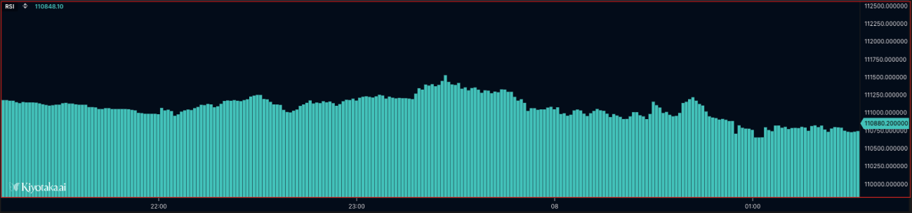
Renders data as vertical bars, commonly used for volume, histograms, deltas, and positive/negative oscillator values. Use colors and colorIndex to distinguish bullish/bearish or above/below-zero states.
plotBar(value, width?, colors?, colorIndex?, showPriceDisplay?, label?, desc?) — bar chart.
| Parameter | Type | Description |
|---|---|---|
value | TimeSeries | OHLC data series |
width | number | Bar width (default: 1) |
colors | color[] | [bullish, bearish] (default: ['orange', 'green']) |
colorIndex | string | number | Per-bar color override |
showPriceDisplay | boolean | Show current value in price scale (default: false) |
Visual Example
//@version=2

define(title="Volume Bars", position="offchart", axis=true);

timeseries ohlcvData = ohlcv(symbol=currentSymbol, exchange=currentExchange);
plotBar(value=ohlcvData.volume, width=1, colors=["#4ecdc4", "#ff6b6b"], label=["Volume"], desc=["Trading Volume Bars"]);
plotCandle
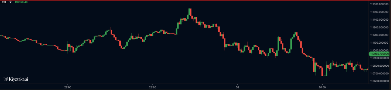
Renders OHLC data as candlesticks. Use it for price-style visualizations, custom candle coloring, or derived candle series where each bar has open, high, low, and close values.
plotCandle(value, width?, colors?, colorIndex?, showPriceDisplay?, label?, desc?) — candlestick chart from OHLC data.
| Parameter | Type | Description |
|---|---|---|
value | TimeSeries | OHLC data series |
width | number | Candle width (default: 1) |
colors | color[] | [bullish, bearish] (default: ['orange', 'green']) |
colorIndex | string | number | Per-bar color override |
showPriceDisplay | boolean | Show current value in price scale (default: false) |
Visual Example
//@version=2

define(title="Candlestick Chart", position="offchart", axis=false);

timeseries ohlcvData = ohlcv(symbol=currentSymbol, exchange=currentExchange);
plotCandle(value=ohlcvData, width=1, colors=["#4caf50", "#f44336"], label=["Price"], desc=["OHLC Candlestick Chart"]);
plotShape
Renders markers at specific values on the chart, such as signal dots, crossover markers, or event highlights. Use na for bars where no marker should be drawn, and pass a visible value only when the signal exists.
plotShape(value, shape, width?, colors?, colorIndex?, fill?, showPriceDisplay?, label?, desc?) — custom shapes / markers.
| Parameter | Type | Description |
|---|---|---|
value | TimeSeries | Data series for shape positioning |
shape | ShapeType | Shape type (currently only 'circle' is supported) |
width | number | Shape border width (default: 2) |
colors | color[] | Color array (default: ['orange']) |
colorIndex | string | number | Per-bar color override |
fill | boolean | 'momentum_fill' | 'default' | Fill options |
showPriceDisplay | boolean | Show current value in price scale (default: false) |
Visual Example
//@version=2

// Basic circle shape - solid fill
plotShape(value=buySignals, shape="circle", width=3, colors=["#00ff00"], fill=true, showPriceDisplay=true, label=["Buy"], desc=["Buy Signal Markers"]);

// Circle with no fill (outline only)
plotShape(value=sellSignals, shape="circle", width=2, colors=["#ff0000"], fill=false, showPriceDisplay=true, label=["Sell"], desc=["Sell Signal Markers"]);

// Circle with 30% opacity fill (70% transparent)
plotShape(value=neutralSignals, shape="circle", width=2, colors=["#0000ff"], fill=0.3, showPriceDisplay=false, label=["Neutral"], desc=["Neutral Signal Markers"]);

// Circle with 80% opacity for semi-transparent markers
plotShape(value=weakSignals, shape="circle", width=2, colors=["#ffff00"], fill=0.8, label=["Weak"], desc=["Weak Signal Markers"]);

// Dynamic shape based on conditions
var signal = crossover(fast_ma, slow_ma) ? high : na
plotShape(value=signal, shape="circle", width=4, colors=["#00ff88"], fill=0.5, label=["Cross"], desc=["Crossover Signal"]);
plotText
Renders text anchored to a price level, so the annotation moves with the chart scale. Use it for per-bar labels, signal text, price-level notes, or contextual annotations tied to market data.
plotText(text, color, price, size?, xAlign?, yAlign?, fill?, backgroundColor?) — render a text label at a specific price level.
| Parameter | Type | Description |
|---|---|---|
text | string | Text content |
color | string | Text color |
price | number | Y-axis price level |
size | number | Font size in pixels (default: 12) |
xAlign | string | "LEFT" | "CENTER" | "RIGHT" (default: "CENTER") |
yAlign | string | "TOP" | "CENTER" | "BOTTOM" (default: "CENTER") |
fill | boolean | Add a background fill behind the text (default: false) |
backgroundColor | string | Background color when fill=true |
Visual Example
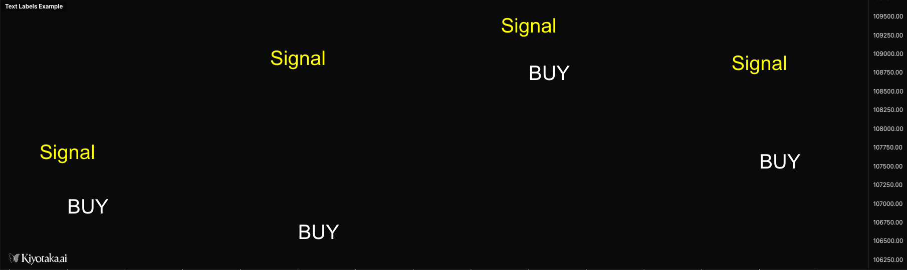
//@version=2

define(title="Text Labels Example", position="offchart", axis=false);

timeseries ohlcvData = ohlcv(symbol=currentSymbol, exchange=currentExchange);

// Display text at specific price level
plotText(text="Signal", color="yellow", price=ohlcvData.close, size=12, xAlign="CENTER", yAlign="CENTER");

// Display text with background
plotText(text="BUY", color="white", price=ohlcvData.low, size=14, xAlign="LEFT", yAlign="BOTTOM", fill=true, backgroundColor="green");

// Display dynamic text with formatting
if (isLastBar) {
    plotText(text="[ Volume Delta ]", color="gray", price=50, size=10, xAlign="LEFT", yAlign="CENTER");
}
plotLabel
Renders a fixed-position label on the chart panel. Unlike plotText, it does not move with price or time, making it better for status text, current values, dashboard labels, and script metadata.
plotLabel(text, position?, x?, y?, color?, size?, xAlign?, yAlign?, fontFamily?, backgroundColor?) — render a fixed-position text label that doesn't move when panning or zooming.
| Parameter | Type | Description |
|---|---|---|
text | string | Text content |
position | string | Anchor: "top_left" / "top_center" / "top_right" / "middle_left" / "middle_center" / "middle_right" / "bottom_left" / "bottom_center" / "bottom_right" |
x | number | X pixel offset from anchor (or absolute X if no position) |
y | number | Y pixel offset from anchor (or absolute Y if no position) |
color | string | Text color (default: "#ffffff") |
size | number | Font size in pixels (default: 12) |
xAlign | string | "LEFT" | "CENTER" | "RIGHT" (auto-set from position) |
yAlign | string | "TOP" | "CENTER" | "BOTTOM" (auto-set from position) |
fontFamily | string | Font family (default: "Arial") |
backgroundColor | string | Background color behind the text |
//@version=2

define(title="Labels Example", position="onchart", axis=false);

timeseries data = ohlcv(symbol=currentSymbol, exchange=currentExchange);

// Display labels at predefined positions
plotLabel(text="Top Left", position="top_left", color="#00ff00", size=14);
plotLabel(text="Top Right", position="top_right", color="#ff0000", size=14);
plotLabel(text="Bottom Center", position="bottom_center", color="#ffff00", size=12);

// Display label with offset from position
plotLabel(text="Offset Label", position="top_left", x=50, y=30, color="#ffffff", size=12);

// Display label at absolute pixel position
plotLabel(text="Absolute Position", x=100, y=200, color="#00ffff", size=16);

// Display dynamic value with background
if (isLastBar) {
    plotLabel(text="Price: " + data.close, position="top_right", color="#ffffff", size=14, backgroundColor="#333333");
}
plotTable
Renders a fixed-position table for compact dashboards and summary panels. Use it to show current indicator values, market stats, symbol/exchange context, or multi-row diagnostic output without tying the display to a price level.
plotTable(data, position?, x?, y?, headerRow?, headerColumn?, textColor?, headerTextColor?, backgroundColor?, headerBackgroundColor?, borderColor?, borderWidth?, fontSize?, cellPadding?, fontFamily?) — fixed-position table.
| Parameter | Type | Description |
|---|---|---|
data | any[][] | 2D array of cell values; each inner array is a row |
position | string | Anchor (same nine values as plotLabel) |
x / y | number | Pixel offset from anchor |
headerRow | boolean | Style first row as header (default: true) |
headerColumn | boolean | Style first column as header (default: false) |
textColor | string | Default text color (default: "#ffffff") |
headerTextColor | string | Header text color (default: "#ffffff") |
backgroundColor | string | Cell background (default: "#1e1e1e") |
headerBackgroundColor | string | Header background (default: "#333333") |
borderColor | string | Border color (default: "#555555") |
borderWidth | number | Border width in pixels (default: 1) |
fontSize | number | Font size in pixels (default: 12) |
cellPadding | number | Cell padding in pixels (default: 8) |
fontFamily | string | Font family (default: "Arial") |
Visual Example
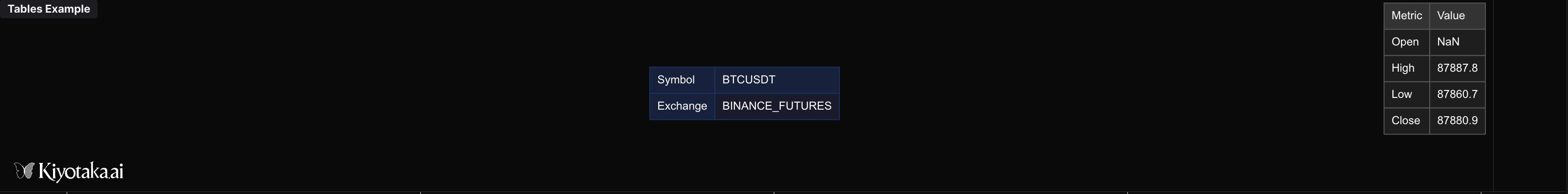
//@version=2

define(title="Tables Example", position="offchart", axis=false);

timeseries data = ohlcv(symbol=currentSymbol, exchange=currentExchange);

if (isLastBar) {
    // Basic OHLC table
    plotTable(
        data=[
            ["Metric", "Value"],
            ["Open", data.open],
            ["High", data.high],
            ["Low", data.low],
            ["Close", data.close]
        ],
        position="top_right",
        headerRow=true
    );

    // Custom styled table
    plotTable(
        data=[
            ["Symbol", currentSymbol],
            ["Exchange", currentExchange]
        ],
        position="middle_center",
        headerColumn=true,
        backgroundColor="#1a1a2e",
        headerBackgroundColor="#16213e",
        borderColor="#0f3460"
    );
}
plotRange
Renders a rectangular region between two timestamps and two price levels. Use it for session ranges, supply/demand zones, liquidity areas, highlighted trade windows, or any boxed region that should stay attached to chart coordinates.
plotRange(time1, price1, time2, price2, color, fillColor) — rectangular box between two time / price points.
| Parameter | Type | Description |
|---|---|---|
time1 | number | Starting timestamp (ms) |
price1 | number | First price level |
time2 | number | Ending timestamp (ms) |
price2 | number | Second price level |
color | string | Border color |
fillColor | string | Fill color (supports transparency) |
Visual Example
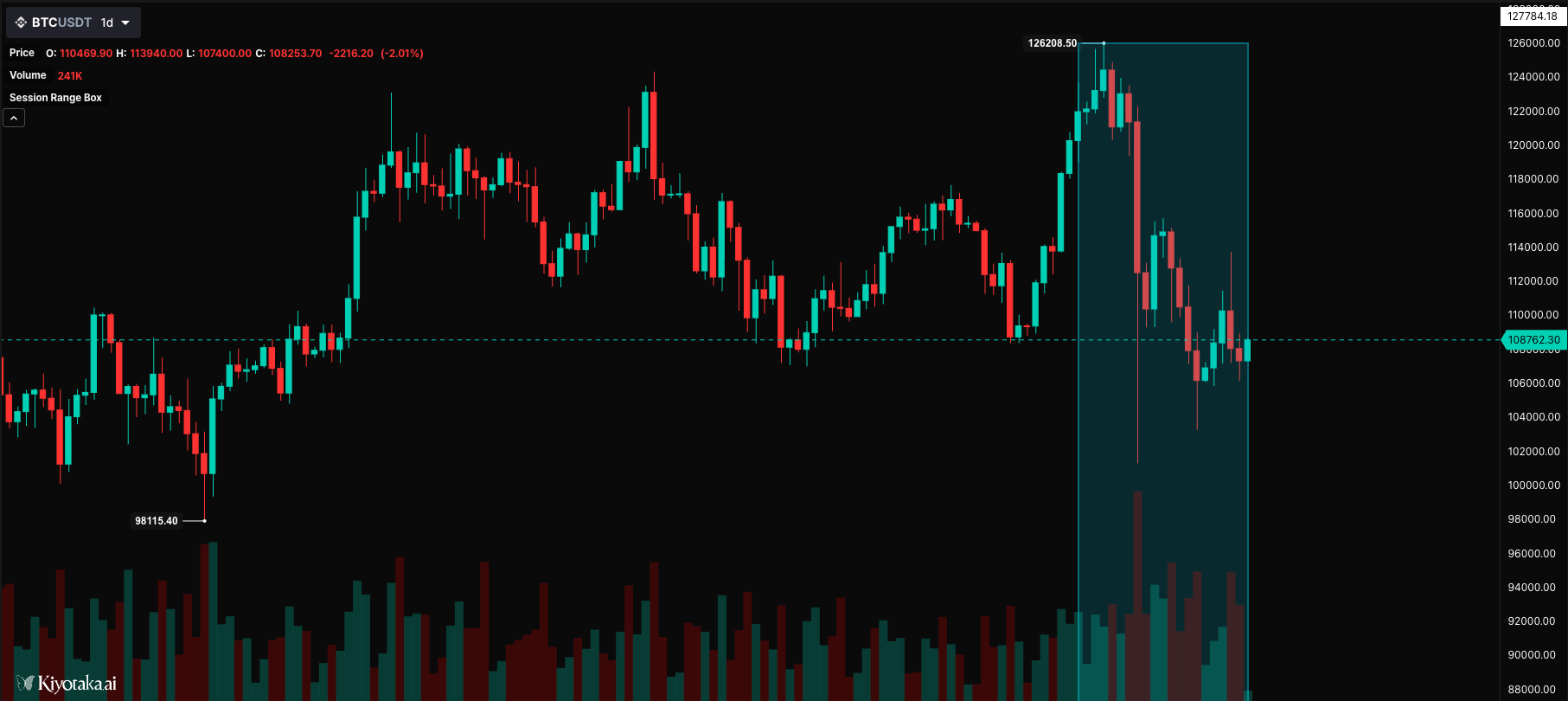
//@version=2

define(title="Session Range Box", position="onchart", axis=false);

timeseries bars = ohlcv(symbol=currentSymbol, exchange=currentExchange);

// Draw a session box highlighting a time range
static sessionStart = 0;
static sessionHigh = 0;
static sessionLow = 1000000;

// Track session high/low
if (bars.high > sessionHigh) {
    sessionHigh = bars.high;
}
if (bars.low < sessionLow) {
    sessionLow = bars.low;
}

// Draw session box at end of period
if (isLastBar) {
    plotRange(
        time1=bars.time - (20 * currentInterval),
        time2=bars.time,
        price1=sessionHigh,
        price2=sessionLow,
        color="#00BCD4",
        fillColor=opacity("#00BCD4", 18)
    );
}
hline - Horizontal Line
Renders a fixed horizontal reference line, commonly used for thresholds like RSI overbought/oversold levels, zero lines, midlines, or static support/resistance levels.
hline(value, color?, width?) — horizontal reference line at a fixed value.
| Parameter | Type | Description |
|---|---|---|
value | number | Y-axis value where the line is drawn |
color | string | Line color (default: "gray") |
width | number | Line width (default: 1) |
Visual Example
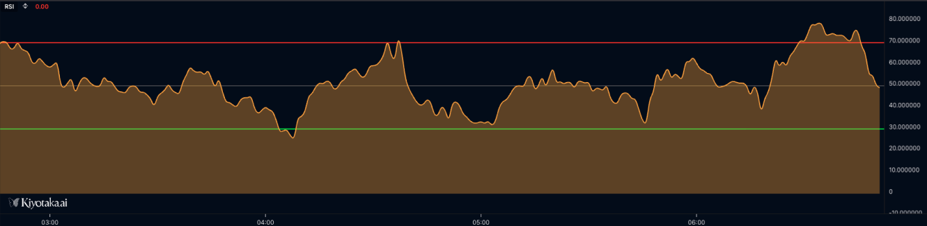
//@version=2

define(title="RSI with Reference Levels", position="offchart", axis=true);

timeseries ohlcvData = ohlcv(symbol=currentSymbol, exchange=currentExchange);

// Calculate RSI
var rsiValue = rsi(source=ohlcvData.close, period=14);

// Plot RSI
plotLine(value=rsiValue, width=2, colors=["#2196f3"], fill=false, smooth=true, label=["RSI"], desc=["14-period RSI"]);

// Basic horizontal lines for reference levels
hline(value=70, color="#ff0000", width=2);  // Red line at 70 (overbought)
hline(value=30, color="#00ff00", width=2);  // Green line at 30 (oversold)
hline(value=50, color="#808080", width=1);  // Gray midline at 50
plotBgColor
Applies a background color for the current bar or condition. Use it to highlight regimes, overbought/oversold zones, volatility states, or signal windows behind the plotted data.
plotBgColor(color, forceOnChart?) — apply a background color band.
| Parameter | Type | Description |
|---|---|---|
color | string | Background color (CSS-style, supports transparency via 8-digit hex) |
forceOnChart | boolean | Render on the main chart even when this script is offchart |
Visual Example
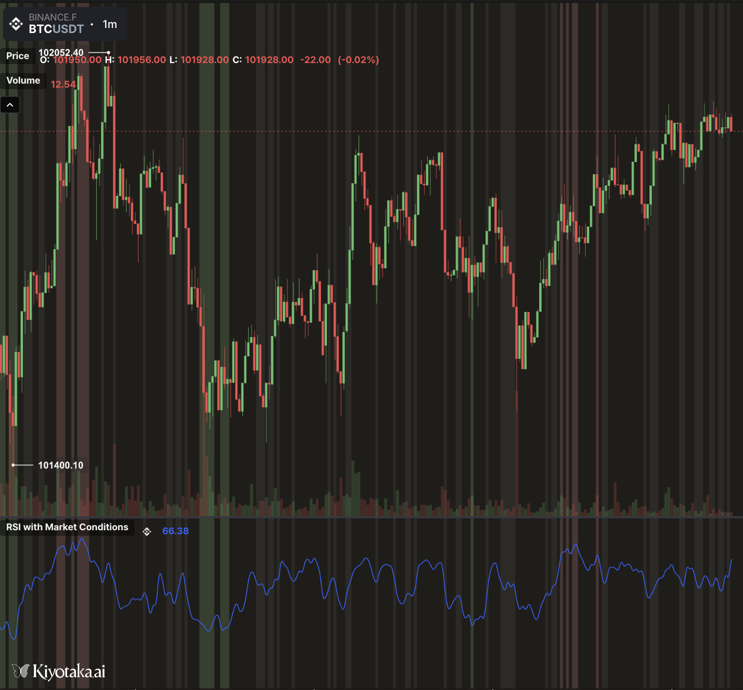
//@version=2

define(title="RSI with Market Conditions", position="offchart", axis=true);

// ==================== INPUTS ====================
// RSI Settings
var rsiPeriod = input(name="rsi_period", type="number", defaultValue=14, label="RSI Period", constraints={min: 2, max: 100});
var overboughtLevel = input(name="overbought", type="number", defaultValue=70, label="Overbought Level", constraints={min: 50, max: 100});
var oversoldLevel = input(name="oversold", type="number", defaultValue=30, label="Oversold Level", constraints={min: 0, max: 50});

// Visual Settings
var showZones = input(name="show_zones", type="boolean", defaultValue=true, label="Show Zone Lines");
var rsiColor = input(name="rsi_color", type="color", defaultValue="#2962FF", label="RSI Line Color");
var lineWidth = input(name="width", type="number", defaultValue=2, label="Line Width", constraints={min: 1, max: 5});

// ==================== DATA & CALCULATIONS ====================
timeseries ohlcvData = ohlcv(symbol=currentSymbol, exchange=currentExchange);

// Calculate RSI
var rsiValue = rsi(source=ohlcvData, period=rsiPeriod);

// ==================== BACKGROUND COLORS ====================
// Determine market condition and apply appropriate background
if (rsiValue < 20) {
    // Extreme oversold - strong green (best buying opportunity)
    plotBgColor(color="rgba(76, 175, 80, 0.3)");
    plotBgColor(color="rgba(76, 175, 80, 0.3)", forceOnChart=true);
} else if (rsiValue < oversoldLevel) {
    // Oversold - light green (potential buying opportunity)
    plotBgColor(color="rgba(129, 199, 132, 0.2)");
    plotBgColor(color="rgba(129, 199, 132, 0.2)", forceOnChart=true);
} else if (rsiValue > 80) {
    // Extreme overbought - strong red (best selling opportunity)
    plotBgColor(color="rgba(244, 67, 54, 0.3)");
    plotBgColor(color="rgba(244, 67, 54, 0.3)", forceOnChart=true);
} else if (rsiValue > overboughtLevel) {
    // Overbought - light red (potential selling opportunity)
    plotBgColor(color="rgba(239, 154, 154, 0.2)");
    plotBgColor(color="rgba(239, 154, 154, 0.2)", forceOnChart=true);
} else if (rsiValue > 45 && rsiValue < 55) {
    // Neutral zone - very light gray
    plotBgColor(color="rgba(158, 158, 158, 0.1)");
    plotBgColor(color="rgba(158, 158, 158, 0.1)", forceOnChart=true);
}

// ==================== PLOTTING ====================
// Plot RSI line
plotLine(
    value=rsiValue,
    colors=[rsiColor],
    width=lineWidth,
    smooth=true,
    label=["RSI"],
    desc=["Relative Strength Index"]
);